Arctic Cold In The Charts
Page created on: 2025-01-11 07:00:43
Arctic cold is mobile bringing us swings in temperatures. If we look past temperature projections and look to the waves we can find signs of those swings in generalities to help prepare.
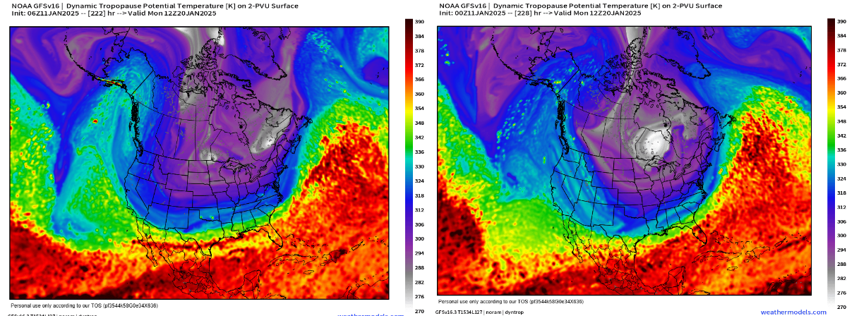
Charts provided are projections for the same time from different updates to establish trending. 2 is not enough trend for high confidence but does help to flush out hiccups when we are looking out 10 days or so in advance. The color coding on this product identifies the persistent air masses that interact and create our weather. Reds into blacks relate to tropical air while purple into white relates to Arctic air. White signifies the coldest air in the northern hemisphere often called Polar Vortex.
Time of projection is Monday January 20 sunrise. Analysis shows the carved out section in much of the central US being fed from cold air reaching back to the North Pole. This setup will deliver colder than normal conditions and when we see a cold core setup near the Great Lakes it can mean record cold as far south as the Ohio River. Signs in longer range data of more than 1 of these intrusions in coming weeks.
Summary: much colder than normal conditions in the charts for period around Monday January 20. Swings in temperatures likely during the next 2 weeks with more colder than normal than warmer than normal conditions.