More Than 1 Chart To Forecast Snow
Page created on: 2025-02-18 08:09:25
RANT:
I try to not see other forecasts. Actively try. I believe looking at anything other than raw data makes an individual a collaborator not a forecaster. I forecast from raw data. It is my opinion without influence from others.
I see forecasts. They are everywhere today. So many of them are so bad. Clickbait, the worst thing to ever happen to dissemination of good forecasts. It is likely a big part of the reason I am more diligently sharing my forecast insights.
I, and others that do what I do, have discussed virga. Precipitation falling from clouds that does not make it to the ground. Evaporates or sublimates in a dry layer below the moist layer where the hydrometeors developed. Not only active radar displays virga, radar simulations and projections display virga. Modern models are sophisticated enough to project, with high detail, what radar images will look like in the future. That high detail includes radar returns that are virga. An individual that only reads radar projections to post forecasts of conditions will overplay the start of snow events, often. It takes more than 1 chart to see the atmosphere and all of its intricacies in model data.
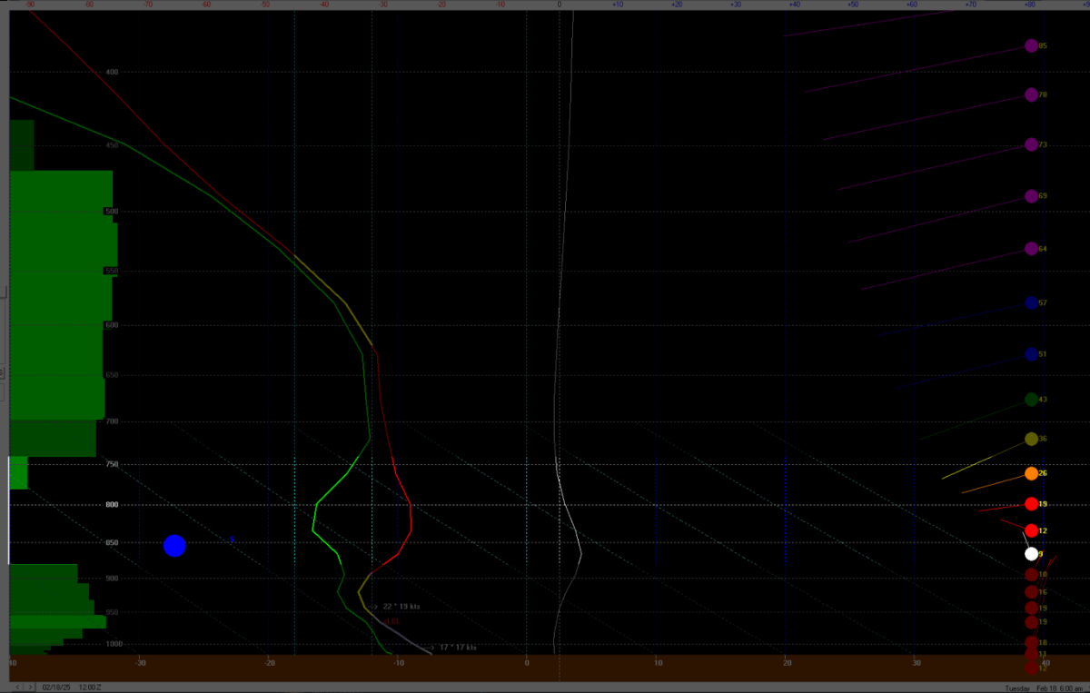
The image I include is the T-diagram projection from an event where I witnessed smart people talk about how much it was going to snow Tuesday morning. The dry layer (where the red and green lines diverge) is so significant that the green shading on the left disappears suggesting there might not even be clouds at that layer. T-diagrams are one of the best tools for forecasting many weather events. Underutilized.
The dry layer will saturate. The snowflakes will eventually make it all the way to the ground. Individuals that used radar sims without T-diagrams likely forecasted too much snow too early. The main part of this winter storm is not tied to the early Tuesday time slot. It takes more than 1 chart to forecast snow. Clickbait is bad for consumers of forecasts.